Brand Guidelines
Everything you need to represent Creator's World consistently. Download our logos, explore our color palette, and learn our design principles.
Color Palette
Our carefully curated color palette ensures consistency across all platforms. Each color has a specific purpose and usage. Click on any color value to copy it to your clipboard.
Primary Brand
Main color
HEX
#f10a0a
RGB
rgb(241, 10, 10)
Primary
Primary color
HEX
#ffffff
RGB
rgb(255,255,255)
Secondary
Secondary color
HEX
#000000
RGB
rgb(0, 0, 0)
Logos & Assets
Download our logos in various formats and sizes. Choose the version that works best for your use case. All logos are available in PNG and SVG formats for maximum flexibility.

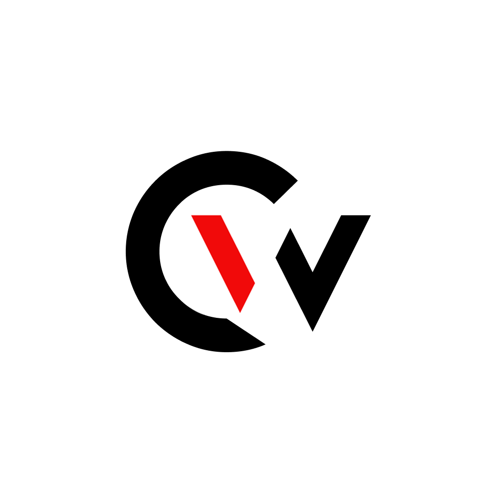
Main Logo - Light with Background
Main Creator's World logo on light background
PNG (1024x1024)

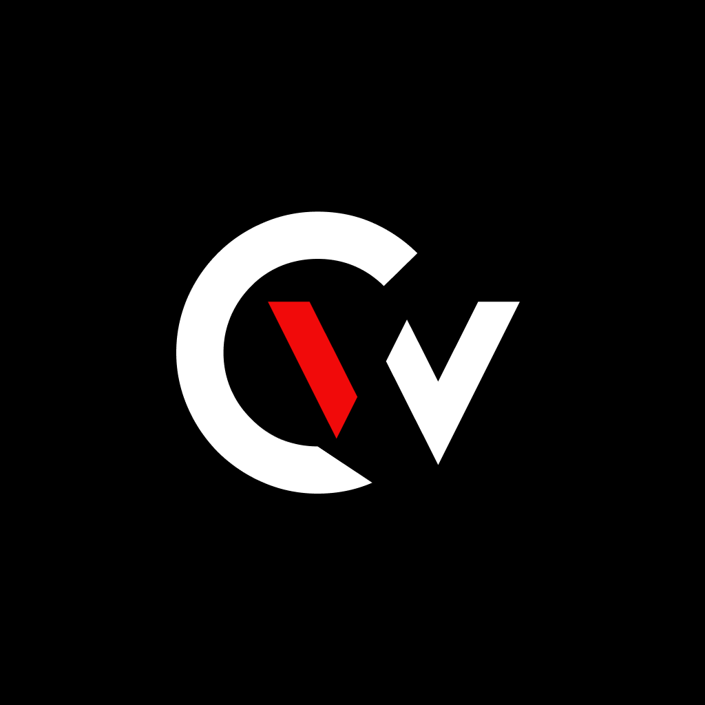
Main Logo - Dark with Background
Main Creator's World logo on dark background
PNG (1024x1024)


Brand Guidelines
Follow these guidelines to maintain consistency and strengthen our brand. These principles guide our design decisions and help us deliver a cohesive experience.
Logo Usage
Our logo is the cornerstone of our brand identity. Always maintain proper spacing and never distort or modify the logo. Use the version that best fits your background.
Color Palette
Our carefully chosen color palette ensures consistency across all platforms. The primary and secondary colors should be used to maintain brand recognition.
Typography
We use Geist Sans as our primary font family. Maintain consistent font sizing and hierarchy across all applications.
Spacing
Consistent spacing creates visual harmony. Use multiples of 4px (4px, 8px, 12px, 16px, etc.) for all margins and padding.
Tone of Voice
Our communication is professional, approachable, and community-focused. Be clear, honest, and supportive in all interactions.
Visual Style
Modern, clean, and minimalist. We use subtle animations, smooth transitions, and intuitive interactions to create delightful experiences.
Logo Usage Rules
To maintain brand integrity, please follow these guidelines when using our logo.
Do's
- Use the logo on both light and dark backgrounds
- Maintain clear space around the logo
- Use transparent version on complex backgrounds
- Scale proportionally without distortion
- Use official brand colors
Don'ts
- Rotate or skew the logo
- Change the colors or proportions
- Add effects like shadows or glows
- Use low-resolution versions
- Combine with competing logos
Questions About Our Brand?
Need clarification on how to use our brand? Our team is happy to help you get it right.